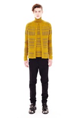
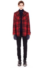
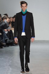
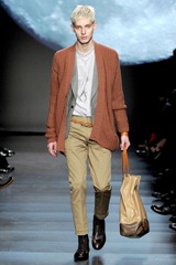
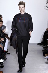
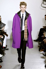
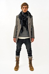
Sorry for the lack of posts, i’ve been caught up with Lulu and her outfits (you know what i mean…). Moving on, now let’s talk about what was presented during Paris fashion week this season for menswear. Nicholas Ghesquière presented a collection that for me, was a balance between the classic good boy look -and- the futuristic bad boy look, explained here: mixing a burnt yellow knitted cardigan and sweater combo with black skinny pants and black lace-up metal cap-toe creepers. Yes, both his collections for womenswear and menswear have a symbiosis (mostly in prints), but in this case i didn’t liked the re-interpretation of the flowers-and-birds print used as a print for shirts. Favorite Look: #4 (red and black plaid coat, black pants, metal cap toe lace up creepers, black skinny pants and black sweater). Acne, Acne, Acne… you have made me happy (how corny and dummy did i sound?). Jonny Johansson made a collection that i’m completely in love-with. The simplicity and de-preoccupied vibe were mixed with sarcasm-(came via the “bimbo” sweater), bright colors, flowy and light fabrics and well tailored pieces were (in a world where everything seems a little bit try-hard) refreshing. Favorite Look: #1 (The Paris and the Statue of Liberty printed sweater and navy blue pants combo). At a first glance, the inspiration and the collection quite didn’t collide at Paul Smith. But when presented, it was clearly that he was going back a few decades. To be specific, the transition from the 60’s to the 70’s when space age, futuristic and modern shapes, materials and pieces were in full bloom. That, mixed with the people of that time and the way they incorporated those space age clothes to their daily wardrobe, for me, was the whole inspiration and idea behind this collection. Whilst i didn’t liked the puffy silver coats, i did liked the hippie-boho easy to wear pieces. Favorite Look: # 2. Raf Simons on the other hand, continued with a collection of super clean shape, sharp cuts and classic silhouettes but with many pops of bright colors that echoed a young clientele. He said to style dot com that part of the collection was designed thinking about college (there you have the young clientele), and it was obvious at a first glance, mostly via the “Dead Prince College” (see how obvious?) sweatshirt made in thick looking fabrics. Another interesting detail was the way the pockets collided with the sleeves on the violet coat creating a curved line that when linked with the dropped shoulders gave the coat an inverted “U” shape. Favorite Look: #2. Yohji Yamamoto for this season presented a collection where there was nostalgia in the pieces, echoing a dark romance, and an obscure softness that reminded me of old English satires and Tim Burton Movies. Using his traditional shape (baggy and wide) he gave them a funny twist via the lips, cherries and skeleton arms that were attached to the many knitted sweaters. Another, well not example, but much more of an illustration of that nostalgia were the long velvet robes that had naked women’s printed in them. Favorite Look: #1. Mihara Yasuhiro presented a collection under his label (which is almost tongue puzzle to pronounce correctly) Miharayasuhiro, that was classic English-boy with a twist (how many times had i said twist), well call it spin now. The shapes weren’t strangers to the runway neither the mans closet, but the spin came via the unusual choice of fabrics (cotton, jersey, velvet [here and there]) and how comfy and warm they looked, for the many suits presented. Favorite Look: #1. Junya Watanabe presented a lovely collection, another vintage-English-school-boy-looking collection, where the hemlines ended at the beginning of the ankles and the blazer were fitted and almost school-boy-uniform-esqe. It was comical how the models walked with their hand on their back giving an innocent-vibe. I spotted Annie Hall’s costume through each piece before i read that the background music was from the soundtrack of said movie. Favorite Look: #3. Christophe Decarnin collection for Balmain Homme is very much how he tends to dress and somehow that’s what people is liking. He continued the military theme for this season, which screamed or rather took some inspiration the spring 2010 womenswear collection. But the to-die-for piece for me were (excluding the perfectly tailored jackets) the stretch biker skinny jeans in the perfect vintage shade. Favorite Look: #4 (that white jacket is amazing). And to conclude with this season menswear collections, let’s comment on Givenchy’s collection. Mostly it expressed some kind of angry-ness, punk movement and John Tavolta’s character in Grease. The most interesting thing from this collection is the Rottweiler dog prints showed in looks 1 and 2 here. Another great collection from Ricardo Tisci for Givenchy.
Pictures: Style Dot Com.
Review: Me.












2 comments:
oh me encantó el look de acne, fabulosos, si fuera hombre me lo pondría ya! Saludos!!!
Acne was awesome.Thanks for the commet. Saludos Igual.
Post a Comment