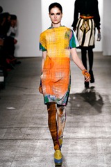
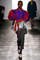
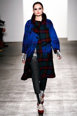
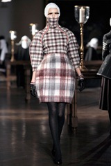
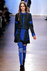
New York fashion week was a great dish to start fashion week season. Sometimes it’s hard to choose favorites from a long and constantly extending list of designers, but, let’s gush a bit about the ones i truly fell over them. Libertine fall 2011 collection was almost like a comeback, everyone said it, and i’m recalling it (why i’m recalling it?, i really don’t know). However the bright neon colors printed in lines that collided with one another creating a quirky checked pattern that looked like twisted neon colored metal wires was the first interesting fact (and i spotted 3) from this collection. The second interesting fact (i know i sound like a high school teacher…) was WHERE that pattern was printed. And where was that pattern printed?. In pieces with vintage-like silhouettes. How cool is that?. And the third interesting fact *drums noise please* was (note: mix fact one and fact two.) how when both mixed, the result was a refreshing and spontaneous back-and-forth aura over the whole collection. Applauses to Johnson Hartig. Duro Olowu’s fall 2011 collection was a misconception to that ridiculous dressing rule mom’s always quote: “don’t put together different prints”. And considering from where the designer is (Nigeria), it was slightly obvious his love for mismatched colorful prints (see look #3 here). And it was beautiful, everything was beautiful (do i sound lame?, of course i do). Before reading the review from style dot com, i was wondering if he also took inspiration from Latin-America and i was quite right. He took Mexico (María Felix was part of the inspirations, see?) and South America (from the Gauchos) as inspiration. And it was understandable because both of their native population tend to create their own prints and use an original mixture of color. Applauses to Duro. Suno’s fall 2011 collection was said, by the designers, to be an old grandma’s attire for a young lady (possibly her granddaughter, quite a weird mix right?). The silhouettes were mostly vintage-y, flowy, and not to tight to the body (just the skinny pencil pants) but somehow everything was up-to-date (very much like Libertine) and the color palette ranged from dark to burnt colored shades. And like Duro Olowu, most of the prints were juxtaposed (but here in a completely different way). Do i have to mention how much i love prints, quirky ones?. I think you know by now. Applauses to Max Osterweis and Erin Beatty. For me, this is how a woman adapts mens clothes into her closet without looking like she was cross-dressing. Thom Browne’s fall 2011 collection was completely and entirely cozzy. Checks were the main pattern (trademark Browne), mostly printed in 3 piece suits in different colors and layered against-their-will (funny how it sounds) with different colored pieces with the same exact print. The most interesting fact from this collection was how he made those skirts and jackets mold into a perfect hour-glass silhouette (think of old perfume bottles) which were quite dramatic and a little bit a-la Rei Kawakubo. Applauses to Thom Browne. I didn’t focused on Steven Alan’s menswear collection(which i found a little bit boring) presented at the same time as the womenswear collection. He said that it was all about Berkley Girls, and for me it was a transition from high school rebel and cool senior year girl, to a smart geeky-esqe freshman woman in college (didn’t i sounded a little bit like André Leon Tally?, naaaah). The silhouettes were mostly and entirely de-preoccupied and effortless. Applauses to Steven Alan, now let’s see how he morphs for next season. At Karen Walker, didn’t those floral prints reminded you of your scary, old and wrinkled to perfection (like a piece of refined oriental wood) grandma's living room wallpaper?. Well it did to me. To the pieces with that floral print, vinyl was inserted to give them a quirky edge. Mostly they were inserted as sleeves, collars and paneled into a maxi flowy skirt. There’s nothing much to say and gush about Karen Walker’s fall 2011 presentation, mentioning that it was cool says it everything. Applauses to Karen Walker and her never changing playlist (you know what i mean). Rag & Bone’s fall 2011 collection was patriotically colored (red, white and blue). And the way they were printed and positioned reminded me of airport road lines, painted faces from a Yankees baseball game (not that i’ve been to any of them but i have their games on TV) and now that i said Yankees, of course they look like sportswear *said with a i-finally-found-the-answer naivety tone of voice*. And how cool is that high school jock (not the jock-strap dummy, whoopsy) jacket?. Well, this would be the last set of applauses (my hands are reaaaaally red), at least for now, to David Neville and Marcus Wainwright.
Pictures: Style dot Com.








No comments:
Post a Comment