London Fashion Week Spring 2012
------------------------------------------------------------------
Richard Nicoll:
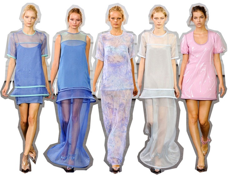
Through the years I’ve become quite a cult-loving fan of Richard Nicoll’s work. This spring he actually wowed me, presenting a collection that was clearly inspired by the 60’s, to be specific and according to what he explained, he was inspired by Henri-Georges Clouzot’s unfinished film “L’enffer” (1964), it’s unfinished yet it’s beautifully unfinished (if that makes any sense at all *said I’m my best english accent*). After explaining the inspiration, and re-searching it you got hooked-up in it. When comparing the movie and the collection, there was a scene where the main character is being choked with some kind of iridescent plastic paper that could be interpreted here as the pink dress with a clear plastic overlay as shown above as an example (or it could simply resemble one of those uncomfortable plastic couch covers that were so popular in that decade), and also the many lighting effect used that could be the flowery water-color printed pieces that were both airy and ghostly. There was also a futurism that echoed the many iconic collections from Pierre Cardin from the 60’s to the mid 70’s that was easily spot-able via the circular hoops on many dresses. Ruffles played quite a strong but soft role (you already know me, it makes sense to me) overall, making some pieces look like nightgowns, here is where underwear or pj’s seem like a great option to leave the house in. One of favorite collections this season.
------------------------------------------------------------------------------------------------------------------------------------
Christopher Kane:
Most designers are inspired by beauty in all kind of ways but to me it’s beyond interesting when designers use tragic, hard-to-understand, sickness, death, etc… topics like those, as inspiration for their collections. Christopher Kane’s outing for this season was pretty much a mixture of abstract thoughts and subjects involving bullying, the girls we hate at school (yes, those mean girls who gave us weird looks for being ourselves, you know what I’m talking about) and pictures of teenage girls in council-state bedrooms with a hand full of stickers. Saying pretty much what was explained by Tim Blanks gives a little more sense to the collection. Those stickers pretty much were portrayed here via those flowery prints over this “ghost fabric” (that I obviously had to mention) made of aluminum and organza that was sort of the gimmicky fact of this collection. Another thing that I noticed were the origami folds, that gave me nods to Issey Miyake’s work, that also resembled wallpaper pilling out (from the pictures of the teenage girls) –a thing that actually gave more sense to the collection after being explained. Embellishments were sent in the final pieces of the collection, mostly flowery sparkly patterned embellishments -another nod to the stickers. As a reflection to all the digging that haves to be done to understand a collection makes me reach the conclusion that not everything has to make sense.
------------------------------------------------------------------------------------------------------------------------------------
J.W Anderson:
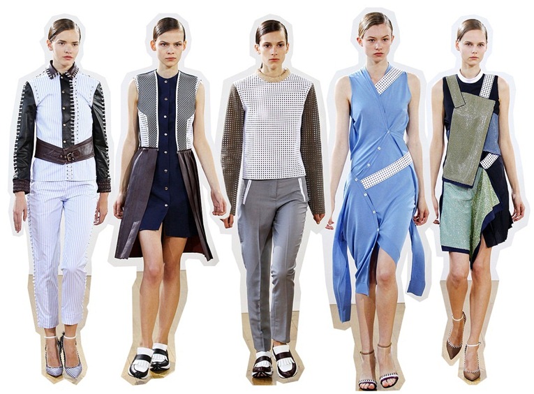
Jonathan Anderson (a.k.a J.W Anderson) is relatively new to scene, and he’s here to stay. The Irish designer’s sophomore collection was rather tough, super structured yet loose (it makes sense), quite experimental and almost soft. The word “chaotic” actually falls perfectly when referring to this collection. Why?. Because it was full chaotic pieces. Yes, most of them were classic pieces if you notice, but more like twisted classic pieces as each and every one of them had a strong personality and a sense of anarchy behind them that can be told after explaining the whole plot behind the overall collection. The collection was based on the idea of “a schoolgirl raised by nuns, finally escaping the convent” –in Tim Blanks words. The idea of that specific girl living under the many restrictions can be illustrated by the many knots and stitched fabrics on several “cardigan dresses” (here’s where the experimental part of the collection takes place -for me-) or on the laced-up pieces like the suit (that opened the show) that basically mixed panels of stripped cotton attached to leather (psss, pssss, hard & soft anyone?) with matching stripped cotton slim pants. Other highlights were the many echoes to sportswear via the perforated pieces, the paisley print and some kind of embellishment that I still cant figure out what it is, maybe chain-mail attached pailletes?. To conclude, I also noticed some kind of a Lisbeth Salander sensitivity under this collection.
------------------------------------------------------------------------------------------------------------------------------------
Acne:

Pictures: Elle dot Com.
Collages and “Reviews”: Me.


1 comment:
divertidas las colecciones
konshon
Post a Comment